The Cricut machine, when writing, will follow the same path it would if it was cutting. So most text will appear "hollow", or as a "bubble" You can avoid this by using a writing font in Cricut Design Space (Most cost around $5) OR, by choosing a free font thin enough that the lines "collapse on themselves" (Those are the fonts listed here). Although these are not truly free writing fonts, they are free fonts that will write without bubbling.
The Names under each sample are linked to the sites to download the font. Simply click on the font name under the sample, to download.
Samples are written with a plain old Bic Round Stic Pen. at .5 inches tall
(To write in 1 inch height, try a thicker pen - the samples for the thicker pens are all 1 inch tall)
Using a Bic Pen Did you know that you can use a regular old bic pen in your cricut machine? It writes great, and fits right in the pen slot! https://amzn.to/468nFGh
Samples are at half an inch tall, with the Precise V5 Pen. If you look at the S in Stymie hairline, and shopping script, you will see they are missing a bit of the s - this is because I was pushing the limits of the margins. I have found that if my text is right up along the edge of the paper, it does better if I weld the text, but I did not do that here. It's really best to not put your text right up against the edge of the page - leave a little margin.
The Cricut machine, when writing, will follow the same path it would if it was cutting. So most text will appear "hollow", or as a "bubble" You can avoid this by using a writing font in Cricut Design Space (Most cost around $5) OR, by choosing a free font thin enough that the lines "collapse on themselves" (Those are the fonts listed here). Although these are not truly free writing fonts, they are free fonts that will write without bubbling.
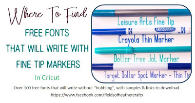
These fonts all work well with the .05 markers - The thin end of the Target Dollar Spot Markers, The Jot Markers from the Dollar Tree, etc. Most of these also work with the thin end of the Leisure Arts Markers, but the Leisure Arts thin tip is a little thinner than the Target and Jot Markers, so sometimes they work on these, sometimes they do not. (they will work with the thicker end of the Leisure Arts Markers) Each Sample tells you which marker I used for the sample, and has a list of links for downloading the fonts, under the sample.
Samples are all 0.8- 1inch tall.
(sometimes 1 inch tall makes the font more than 8 inches wide, in those cases, I shrink the height of the font, to make them all fit neatly on 8.5x11 inch paper) To Download the fonts, click on the font name under the sample - they are all linked to the site where they can be found.
Although this says the samples are 1 inch tall, some may only be .8 or .9- to better fit them on the page. Markers used were the Target Dollar Spot Markers
These were a bit iffy with the Leisure Arts thin tip, but remember, that tip is just a bit smaller than the Jot Dollar Tree & The Target Dollar Spot Markers. Using one of those markers instead, these fonts should work fine.
The fonts above will all work at 1 inch tall, but there are more fonts that will work with these markers, if you are writing at half an inch tall or smaller.
Samples coming soon!
Old Sample Sheets
I've redone all of my sample sheets on 8.5x11 paper, to display better, and you can right click on the image, download it, and print it, if you would like. All of those samples are above, in an almost alphabetical order. These are the "original" sample sheets, which I'm preserving because they were a lot of work originally, and they do show the fonts in different markers and in different arrangements. I'm finding a few fonts on these pages that I did miss in my redo, that may be because they write at .5 but not at 1 inch - I'll figure that out when I finish the .5 samples. Fonts that Are listed below but not above include:
Fancy Pen, High Thin Light (Definitely only at .5)
Alexandra Orleans (incorrectly shown as Adventures O The Mountains in the example above
Good plain text fonts that write well with the fine point markers. Example is in Dollar Tree Markers Also: Leisure Arts Fine Tip, Target Fine Tip, Crayola thin